Violations & Re-Designs
Severity Rating
To quantify the rating process, we create a metric to get the severity for each identified
problem based on frequency, impact, and persistence on a scale of 0-4.
+
+
Will it be easy or difficult for the users to overcome?
Is it a one-time problem that users can overcome once they
know about it or will users repeatedly be bothered by the problem?
Is the issue common or rare?
=
0 No
issue
4 High Priority
Violation
1
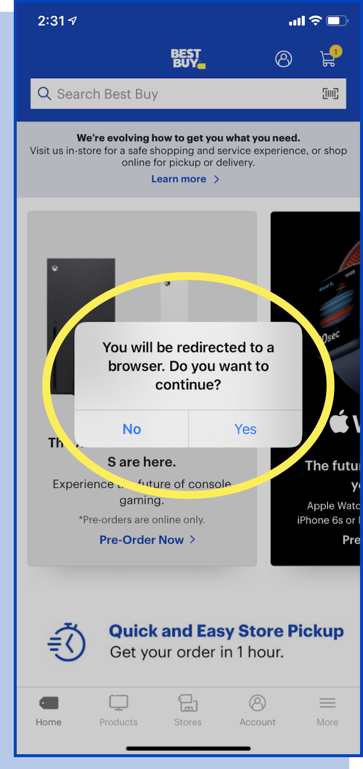
#4 Consistency and standards
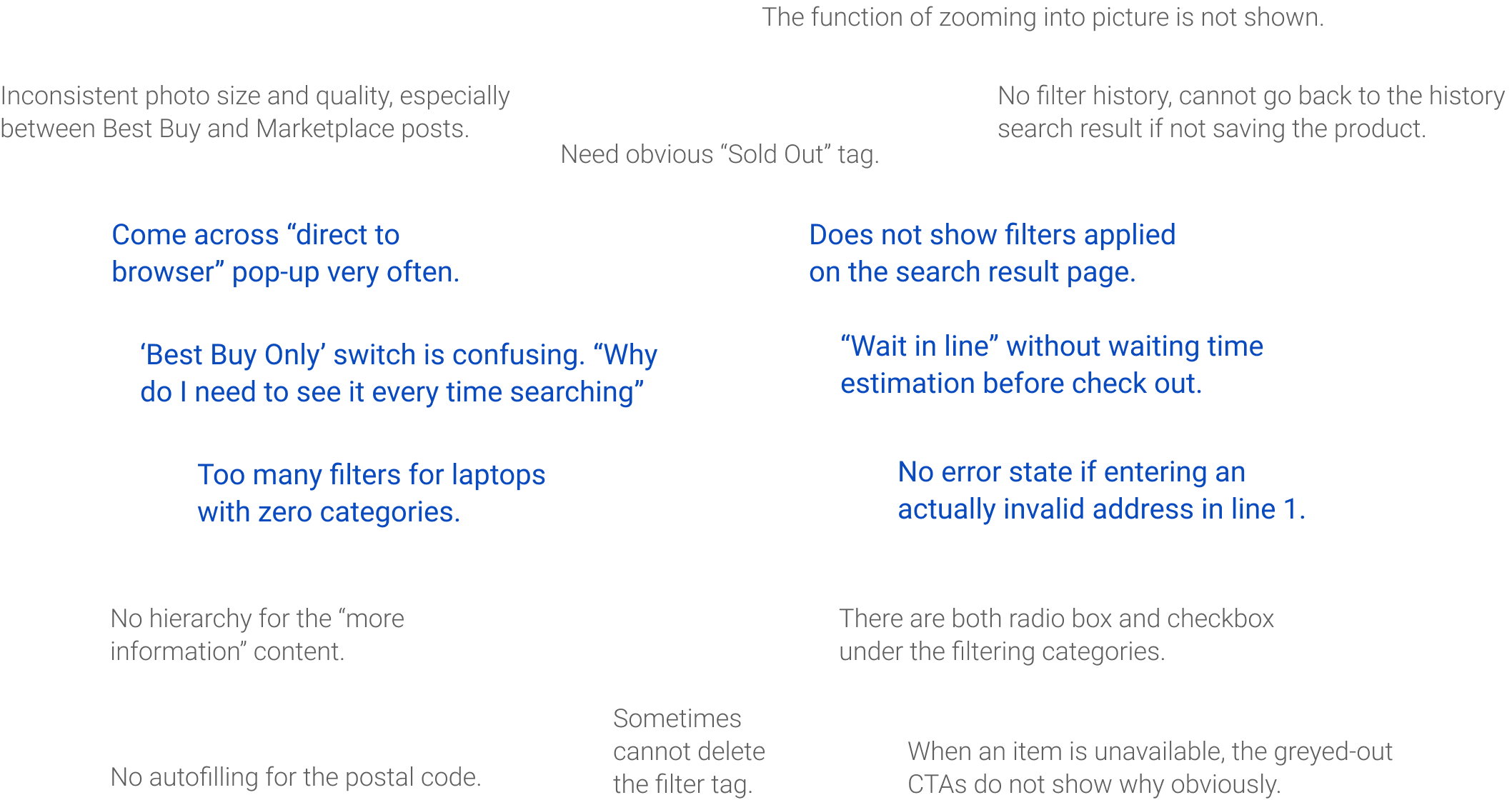
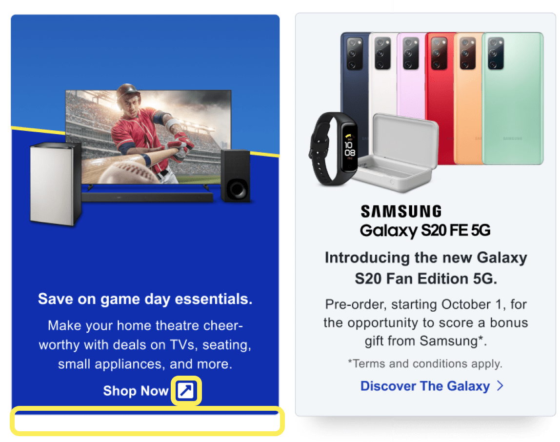
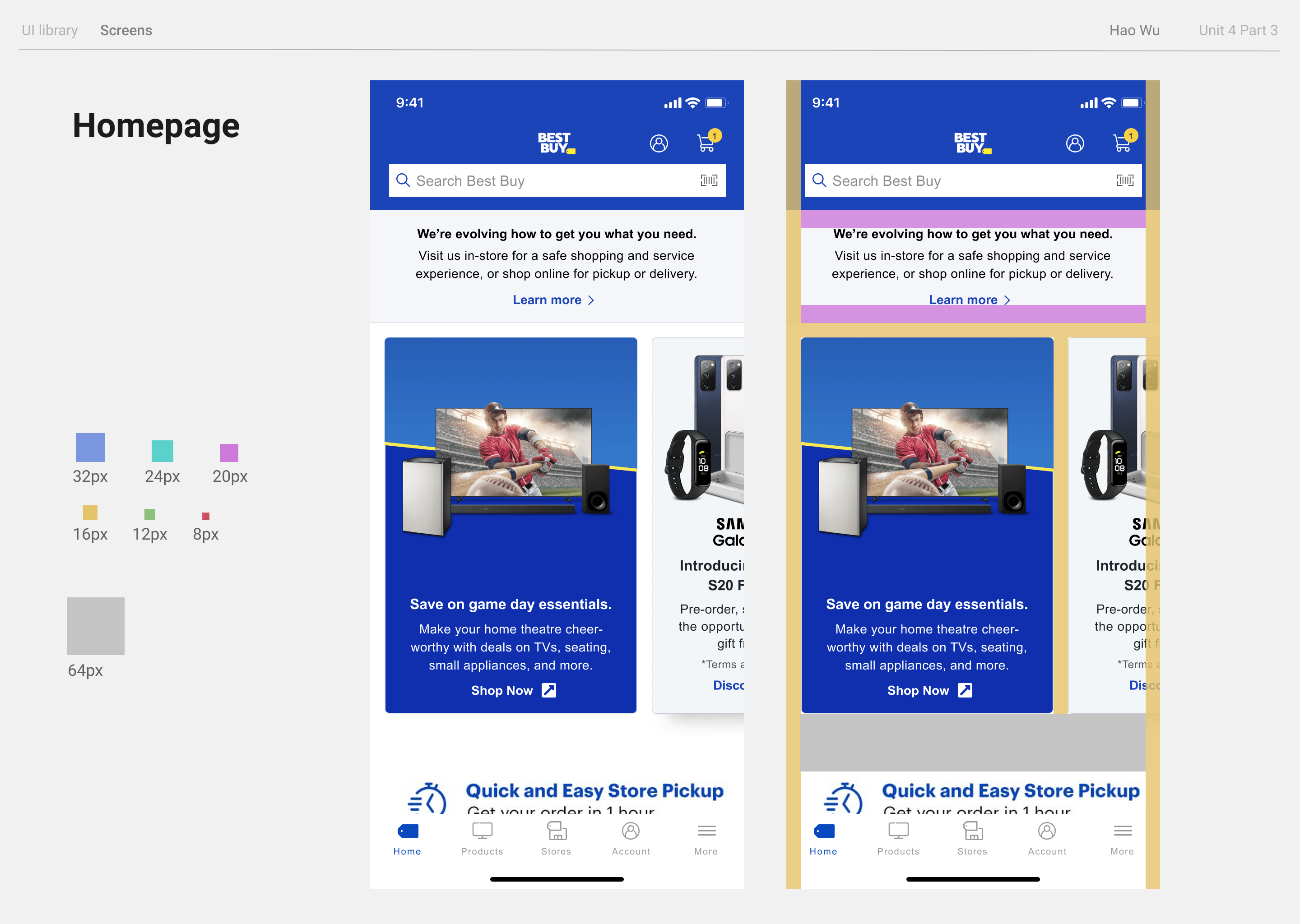
Some featured products link away from the App.
3.0 / 4
since this
problem is hightly persistent and impacts the user’s flow
- Add an external link icon
- Different Card Style

Violation 2
#7 Flexibility and efficiency of use
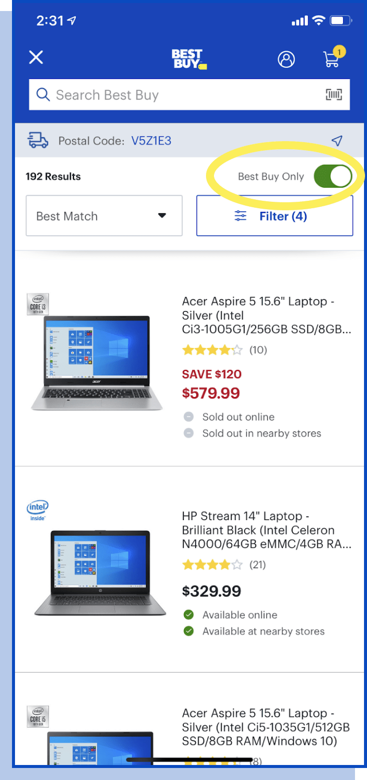
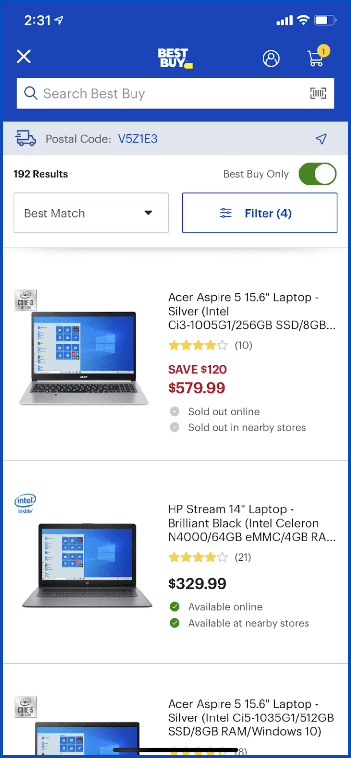
Best Buy Only switch is an advanced feature but too
easy for basic users to notice.
3.0 / 4
for this
problem happens each time searching and impacts the speed of finishing the task
- Hide “Best Only” toggle
- May move it to Filter

Violation 3
#8 Aesthetic and minimalist design
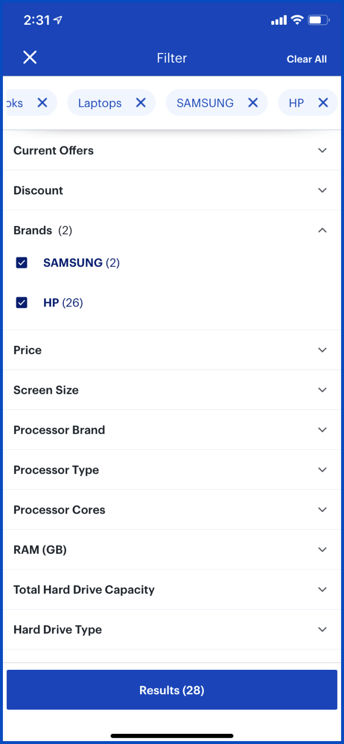
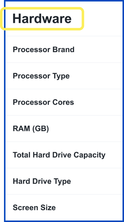
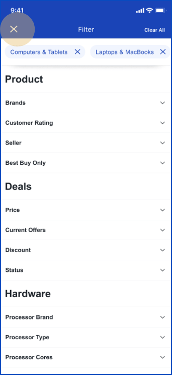
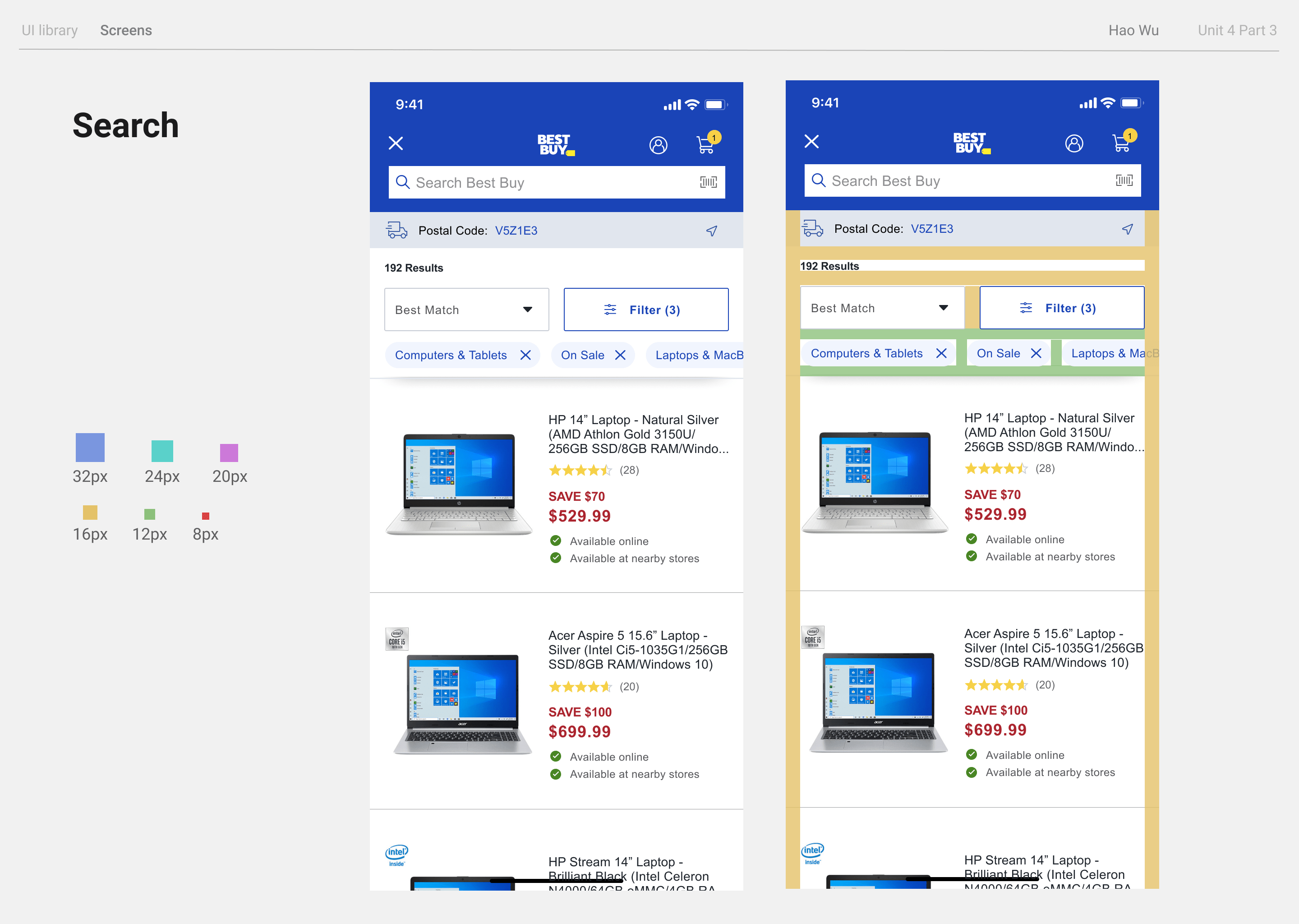
There is an overwhelming amount of filter
options.
3.0 / 4
because this
frustrating problem happens every time the user filters a search and there’s no way to avoid it
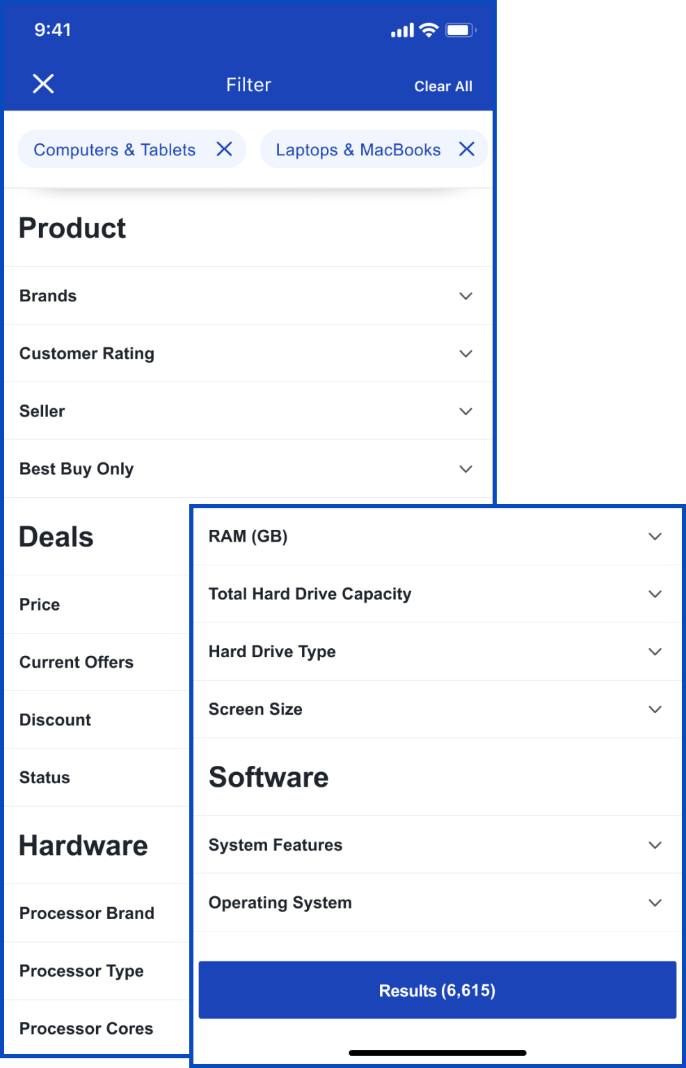
- Organize filters to improve readability
- Add category titles

Violation 4
#6 Recognition rather than recall
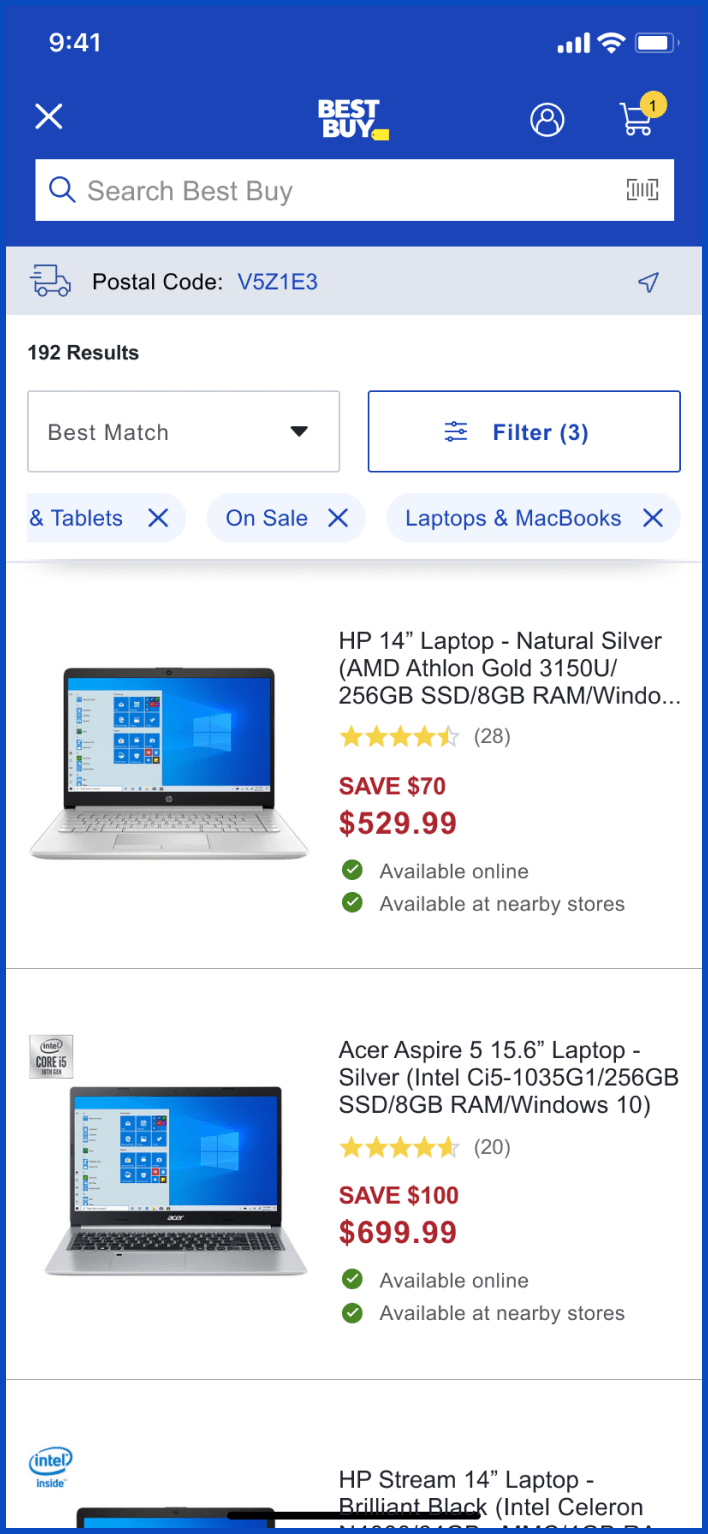
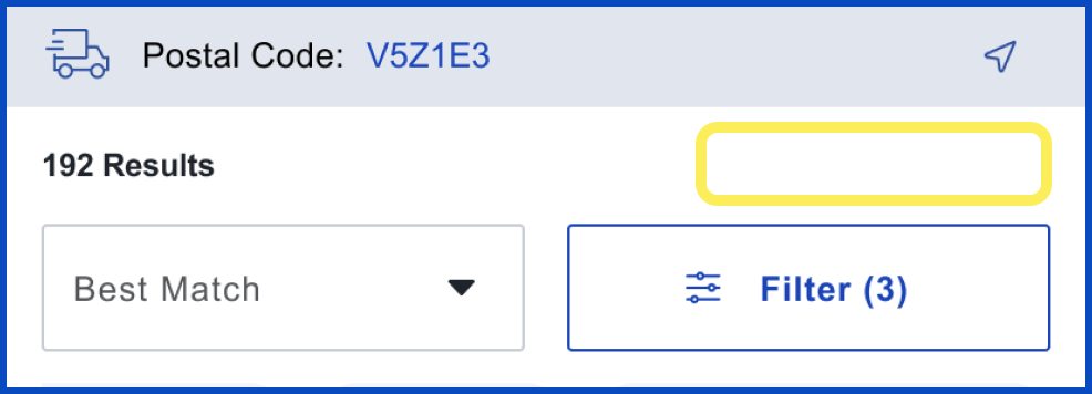
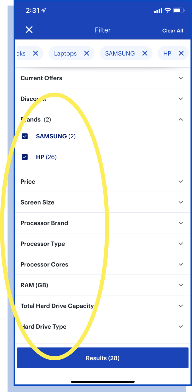
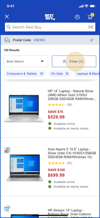
Applied filters are not visible unless going back
to “filter”.
2.7 / 4
for the
problem happens each search, but the user doesn’t always need to recall filters, and can still finish the
task
- Add filter capsules to the search page for users’ convenience of
recalling

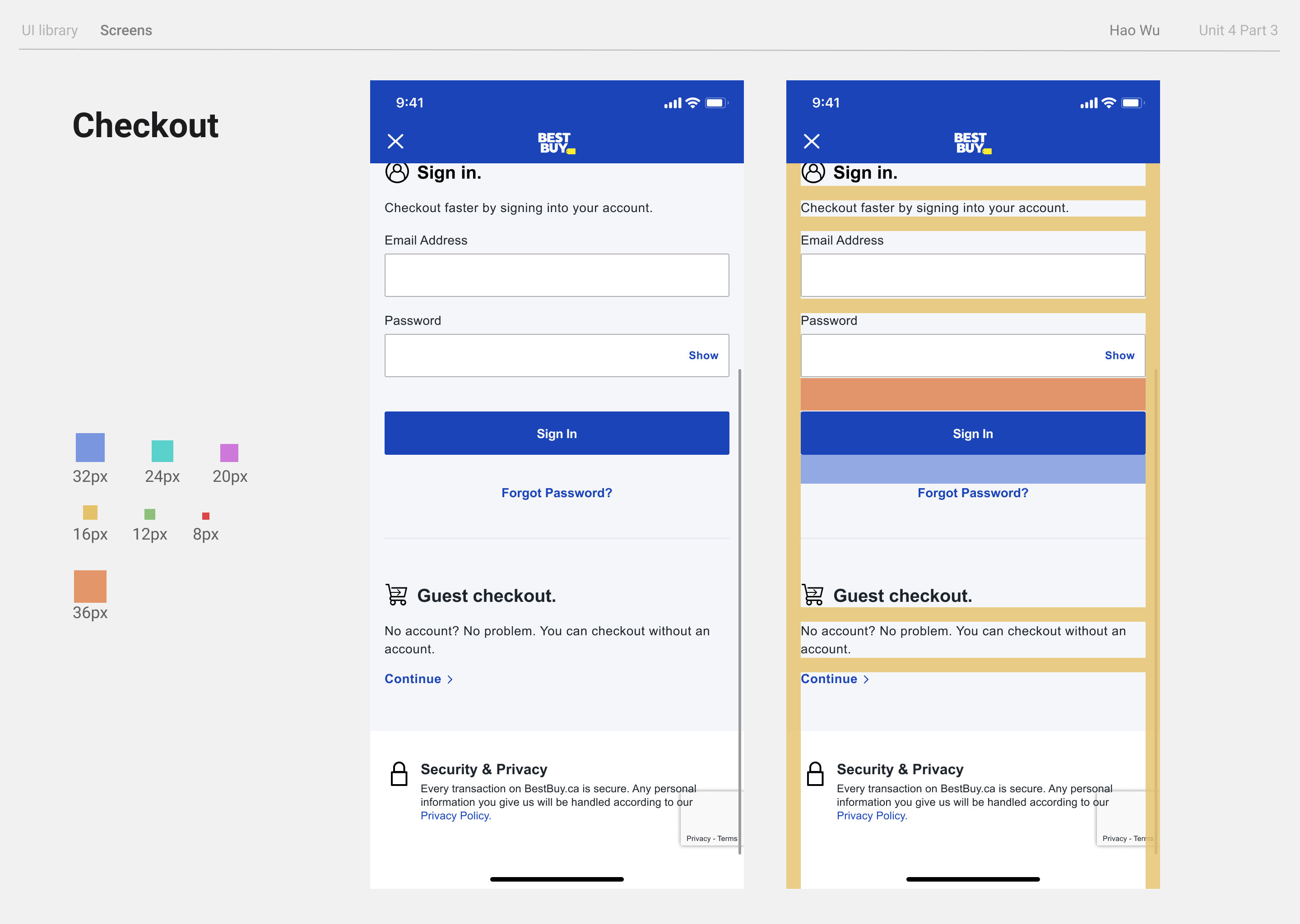
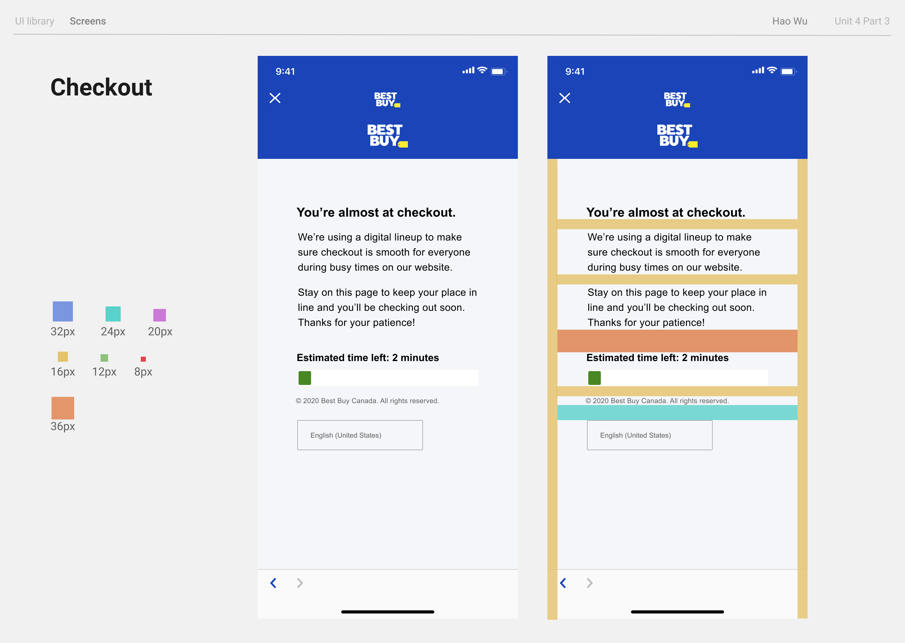
Violation 5
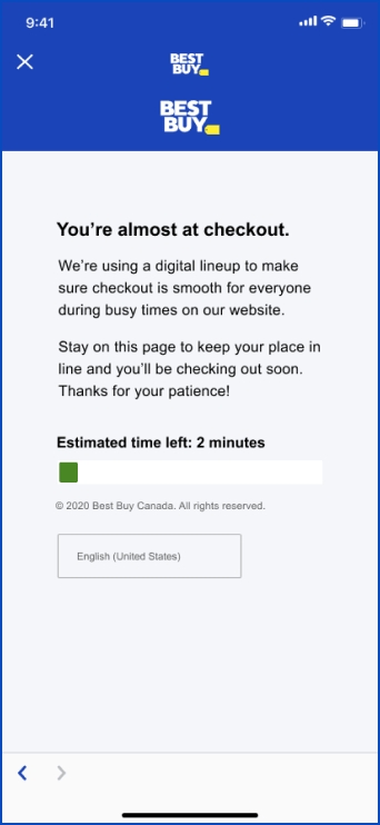
#1 visibility of system status
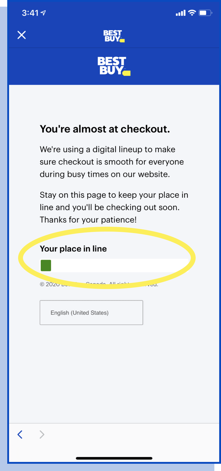
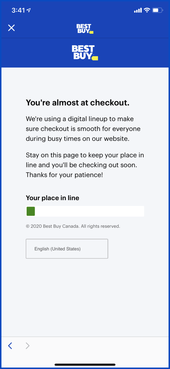
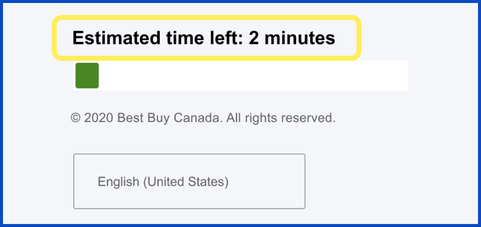
The checkout line does
not provide any waiting
time estimates.
3.3 / 4
since a
confusing checkout reminder could cause users to stop their purchase
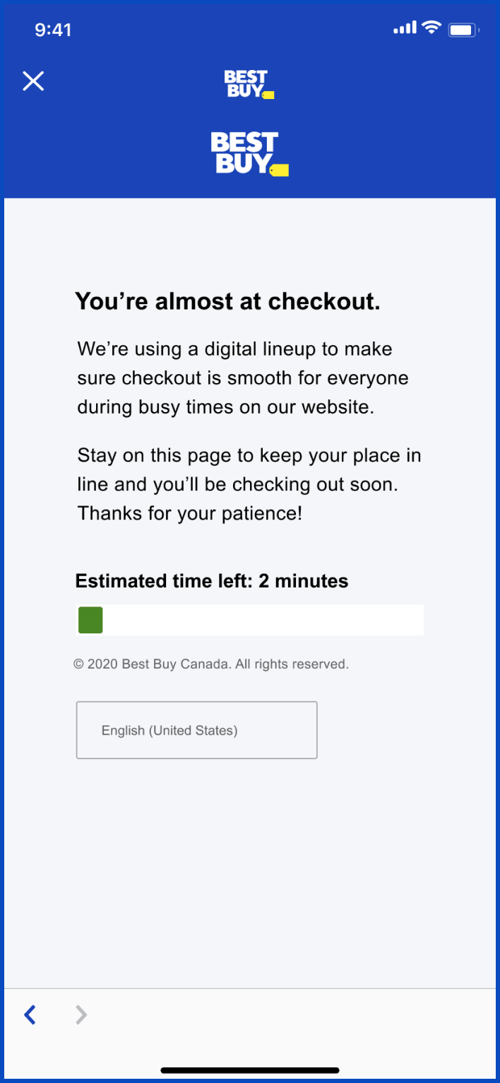
- Add clear estimation of waiting time
- Provide queue position
the user is at

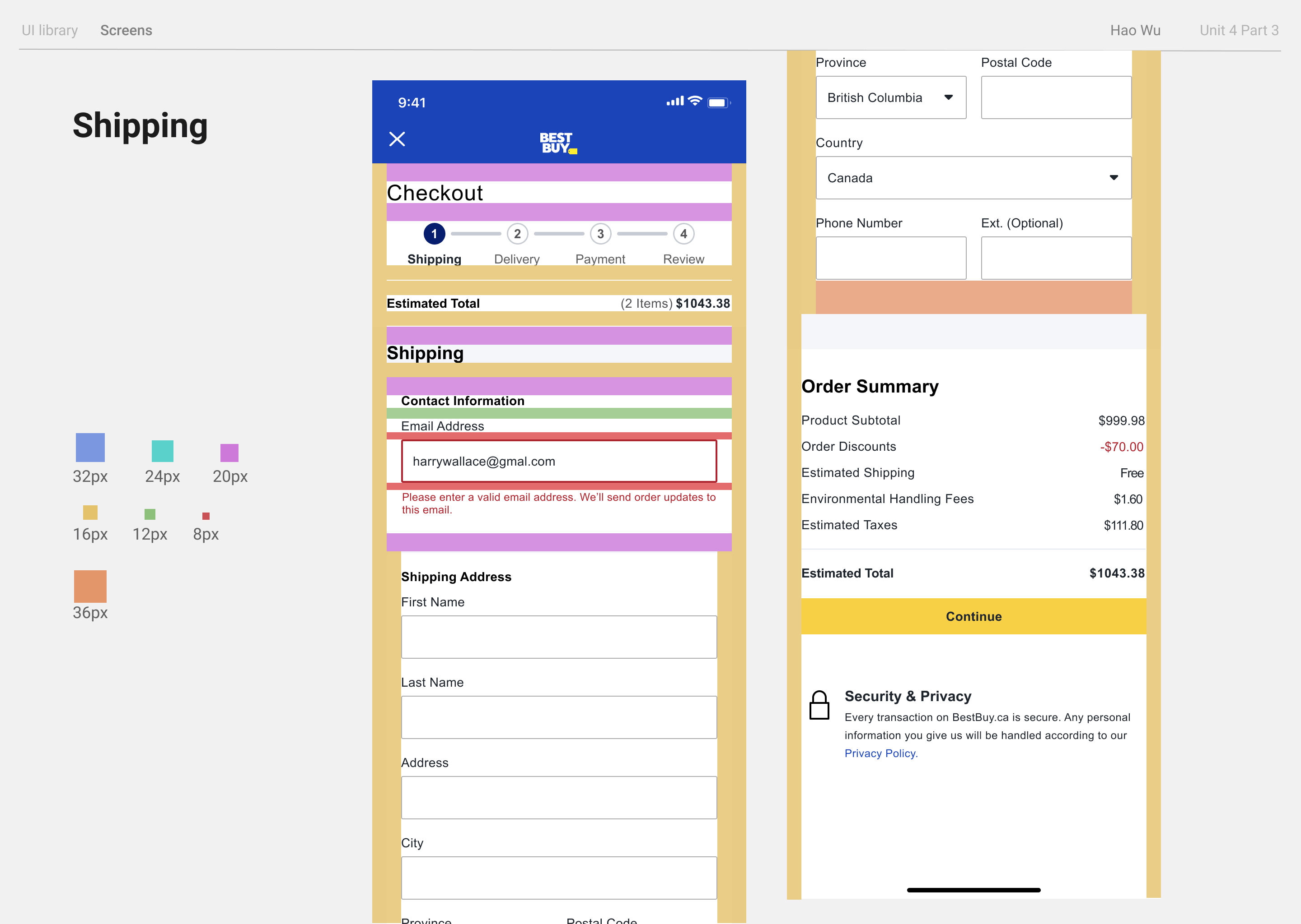
Violation 6
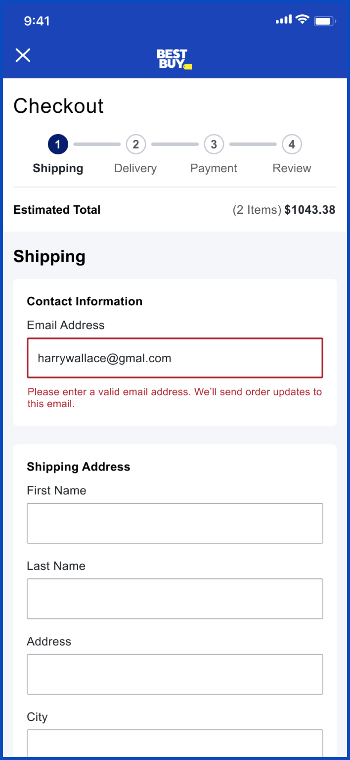
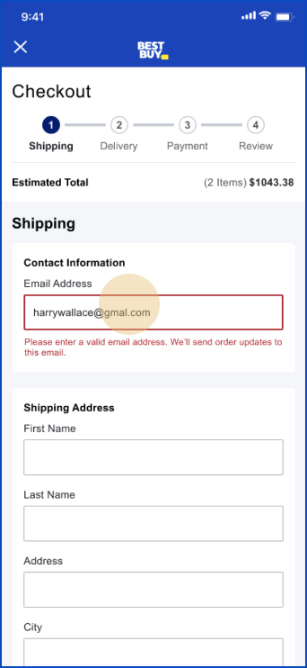
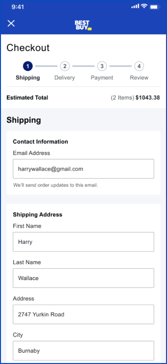
#9 Recognize, diagnose, and recover from errors
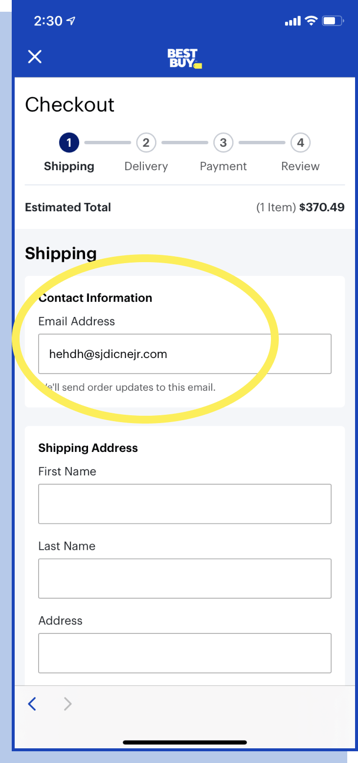
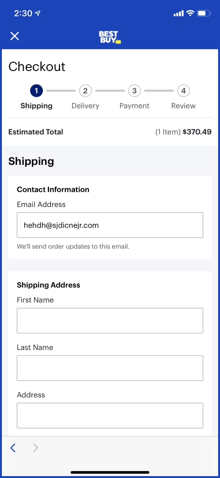
The form does not give
any error messages for
non-existent emails.
3.0 / 4
because this
could mess up the shipping information, but only if a mistake was made
- Add real-time error messages for incorrect information input

Re-designed Task Flow
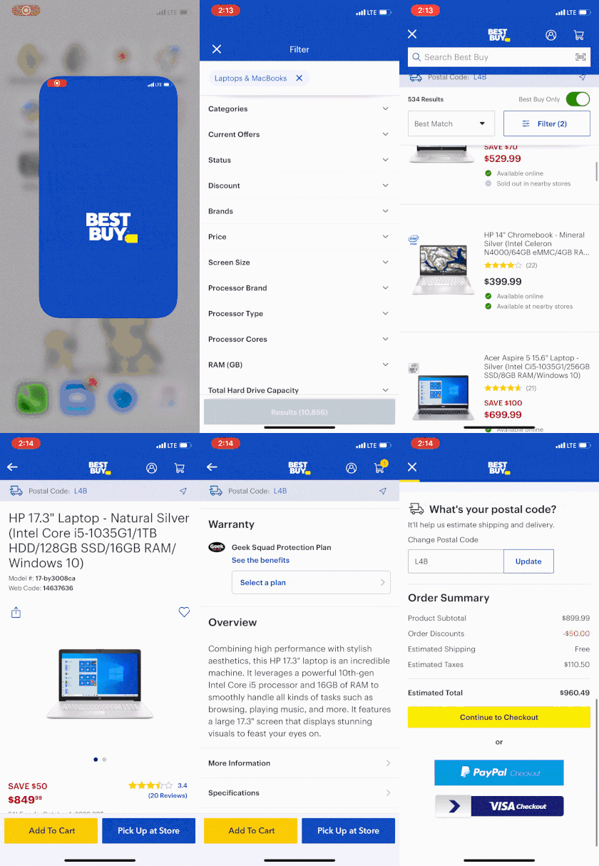
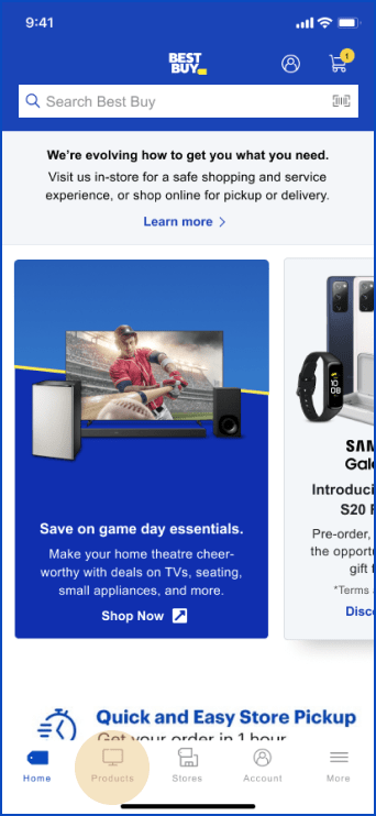
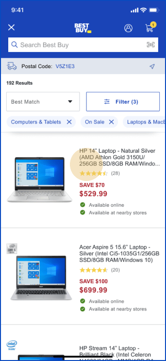
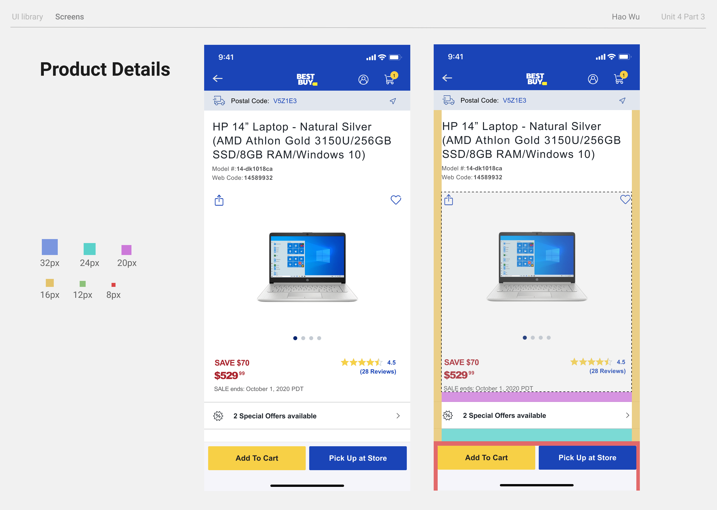
1. Open App and search for laptop
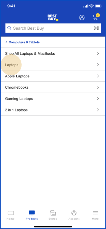
2. Go through the product list
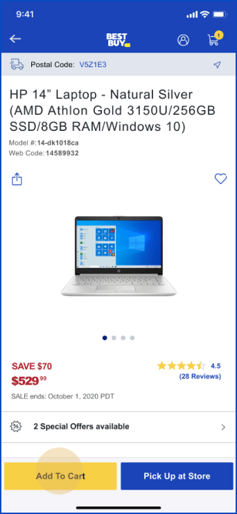
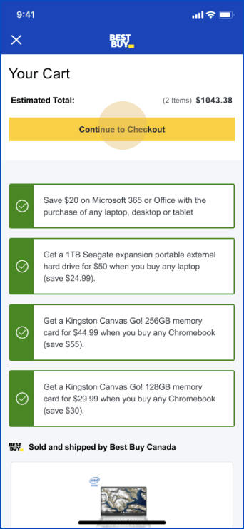
3. Pick one laptop, add it to shopping cart
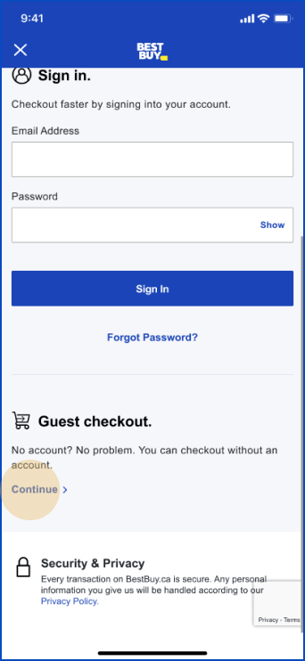
5. Finish checking out and place the order

